A Unified Grain Ledger: From Fragmented Paperwork to Automated Data Clarity
At Gradable, I designed and delivered an intuitive, easy-to-use sales product that linked farmer’s data with their grain buyers. This system integrated complex data across different grain companies to allow farmers to view their sales information to make informed business and crop marketing decisions.
The product allowed farmers to annually track millions of bushel sales and monitor their deliveries to grain elevators.
Overview
Historically, agricultural sales data has been siloed within individual grain buyers, forcing farmers to juggle multiple portals or paper trails. Gradable set out to solve this by creating the first platform to aggregate Contracts, Tickets, and Settlements from various grain distributors into a single, cohesive location.
By partnering with major distributors like ADM and POET, we built a system where farmers could opt-in to have their data synced and normalized. This allowed for informed, real-time business decisions: all in one spot.
Title:
Senior/Lead Product Designer (Sole Designer on Project)
Organization:
Gradable (part of Farmers Business Network - FBN) partnered with ADM (Archer Daniels Midland) and POET Ethanol
Project Roles:
Qualitative Research, Conceptualization, Design, Usability testing, Dev handoff
Tools:
Figma, Miro, Online User Testing Platforms
Duration:
2 Months to first release, iterations after varied
Background & Problem
The core challenge was a many-to-many data mapping conflict. A single contract could be attached to multiple delivery tickets and settlements, while a single ticket might satisfy portions of several different contracts.
The Pain Points:
The Paper Trail: Farmers manually tracked grain tickets against contracts and reconciled them with paper check settlements, leading to a cumbersome financial path.
Inconsistent Data: Different grain companies had varied ways of displaying the same data, leading to massive confusion for farmers selling to multiple buyers.
Hidden Navigation: Critical data types were buried under filter dropdowns in the legacy system, making them "invisible" to users in the field.
Opaque Progress: Farmers couldn't easily see exactly how much they had delivered on a specific contract or which deliveries had been settled.

Research, Interviews, and Testing
To design a digital tool that fit a physical workflow, I had to understand the "physicality" of the harvest.
On-Site Immersion: I visited the largest grain elevator east of the Mississippi to observe the end-to-end delivery process. I shadowed the journey of a single truck: watching as the grain was tested for quality, weighed, and finally delivered into hoppers.
Physical Mapping: Walking the grounds and exploring the massive scale of the elevators helped me understand the high-stress environment where these digital tools are used.
Stakeholder Interviews: I met with grain buyers at the elevator to walk through their internal contract and settlement processes. This helped me bridge the gap between their administrative needs and the farmer's experience.
Technical Audit: I audited legacy software (like Agris) to understand the data semantics. I discovered that "Schedule Lines" were the true unit of measure for farmers, though software often displayed data at a confusing "Contract Level."
Contextual Inquiry: Understanding that this software is used in high-glare environments (like tractor cabs or elevator scales) meant the UX had to be high-contrast and operable with minimal conflict.
Design Strategy
Our strategy shifted the technical burden from the distributors to the platform, creating a "One-Stop-Shop" for farm finances.
Standardized Templating: We created consistent labeling and data structures so that whether a farmer viewed ADM or POET data, the experience remained identical.
Information Hierarchy: Used a "Quick View to Deep Dive" approach: scannable summaries on the main page with detailed drills-ins available via drawers.
Cross-Link Logic: Built an ecosystem where a delivery ticket is never an isolated data point; it always links back to its parent contract and its resulting settlement.
Design
Phase 1: Navigation & Standardization
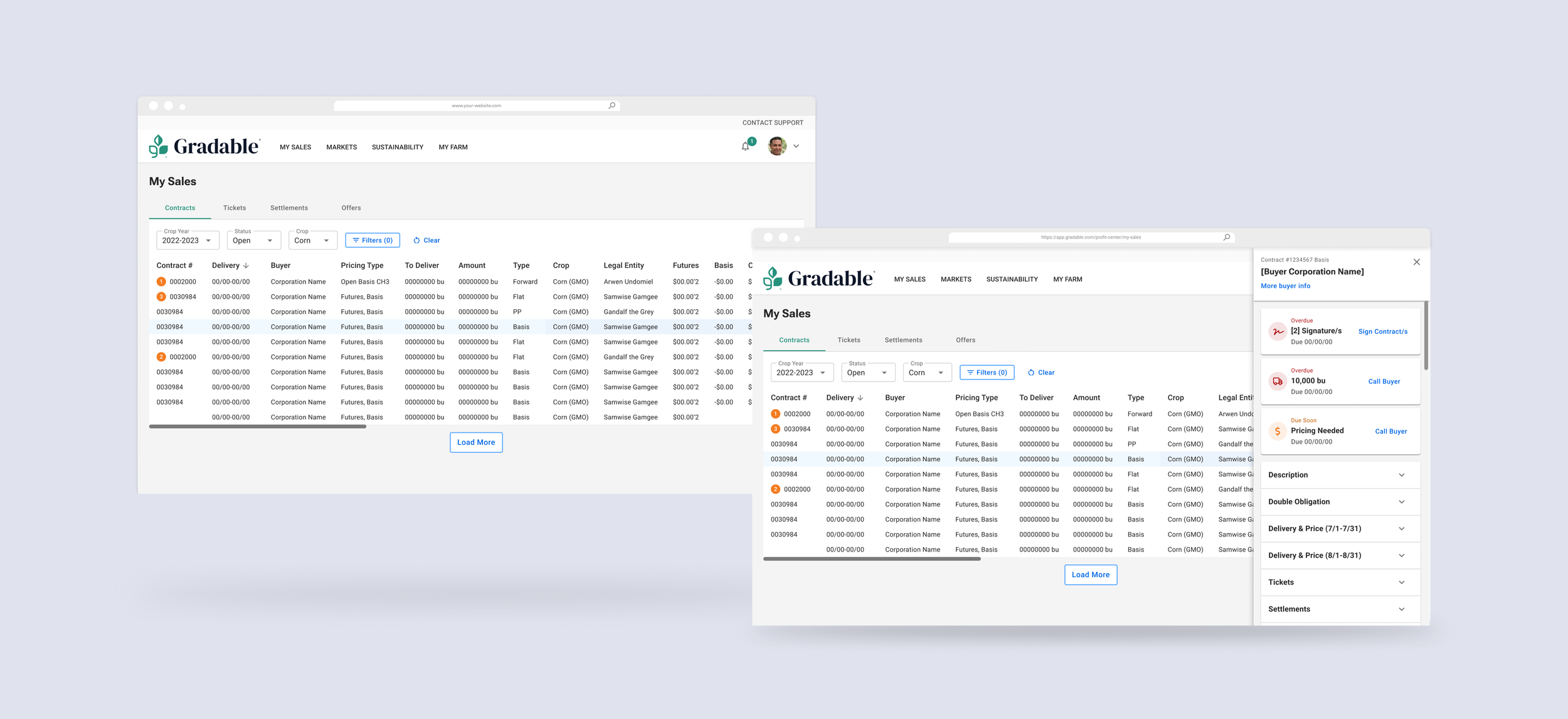
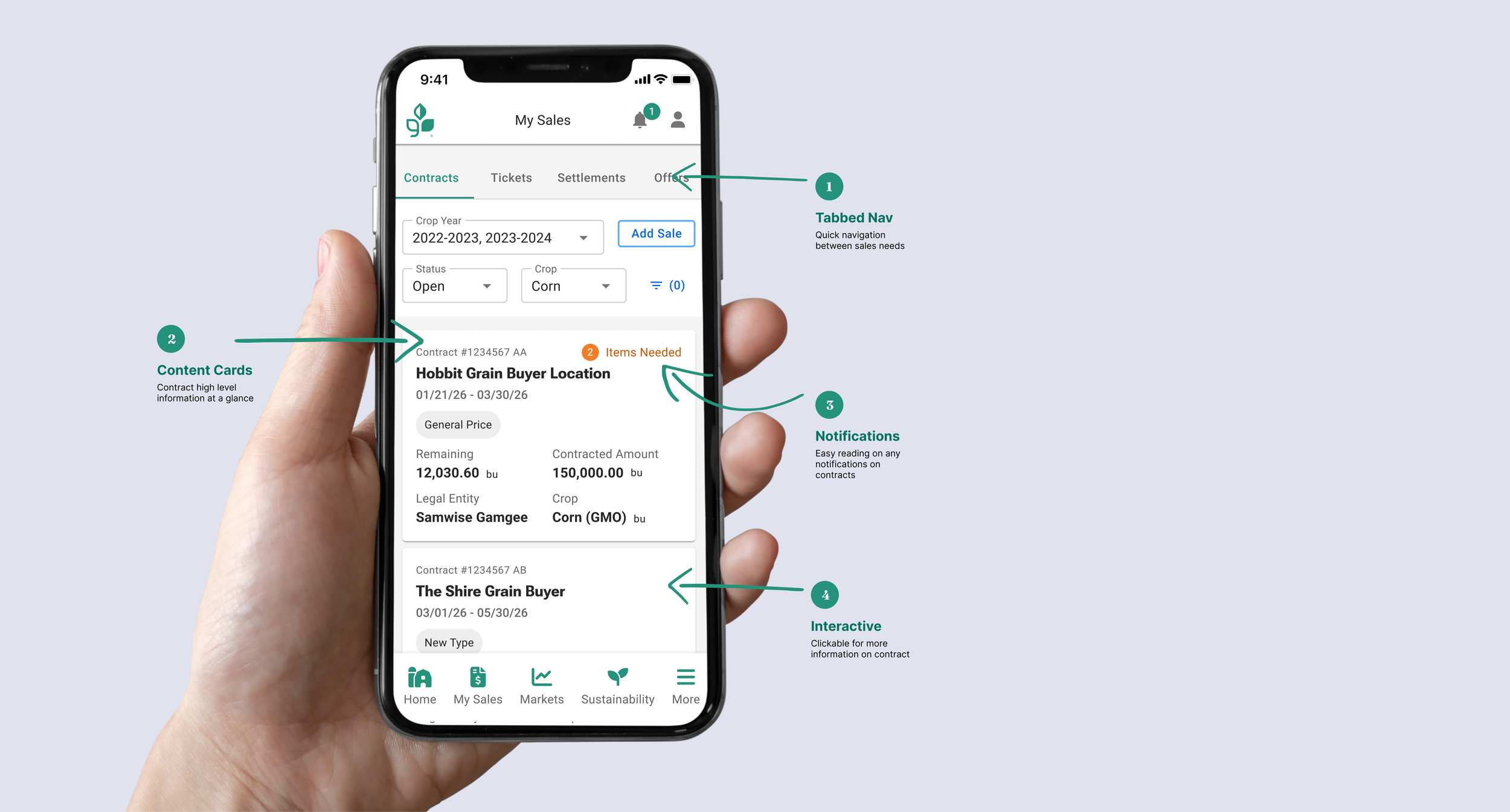
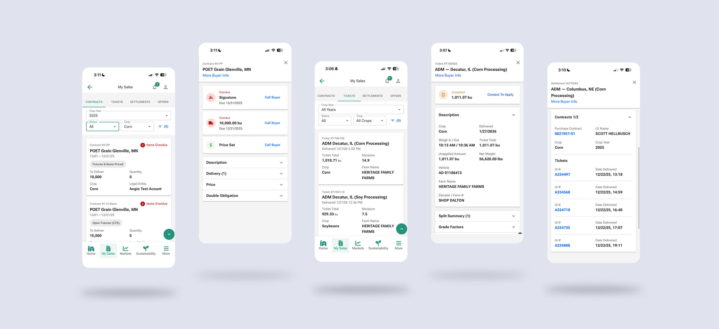
We moved away from hidden filters to a Tabbed Navigation system (Contracts, Tickets, Settlements, Offers) to ensure all types were visible at once.
Desktop: Standardized tables with "Smart Sort" (Important Dates and Overdue tasks at the top).
Mobile: High-contrast cards designed for high-glare outdoor environments.
Notifications: Implemented a "Traffic Light" system: Red for overdue tasks and Orange for items due within 2 weeks.
Phase 2: The Deep Dive (Detail Drawer)
To handle the many-to-many relationship without losing context, I designed a Detail Drawer (built on MUI Dialog).
Accordions: Tucked dense technical data (moisture levels, tare weight, grade factors) into accordions to keep the UI clean.
Persistence: On desktop, the drawer allows the background table to remain visible and clickable, letting farmers compare two rows quickly.
Automated Data: Information is pulled directly from buyer data but presented in an easy-to-read, consistent format.
Outcome
Gradable successfully launched as the industry’s first multi-distributor data aggregator for farmers.
Operational Clarity: Farmers can now see "Applied" vs. "Unapplied" grain totals instantly, eliminating hours of manual reconciliation.
Reduced Burden: By taking the technical burden off grain distributors, we created a streamlined experience that works across multiple companies.
Scalability and Agility: Since the initial launch, we have iterated on this design over five times for our grain partners. The templated and automated design allows for quick turnarounds and improvements based on partner needs without ever impacting the core experience for the farmers.