Visualizing Compliance:
Mapping Field Boundaries for Deforestation Risks in Agriculture
At Gradable, I designed and delivered an intuitive, easy-to-use field boundary mapping system that was critical for regulatory compliance and supporting our grain partners. This system integrated robust editing tools with seamless data ingestion from government agencies and third-party services, ensuring the accurate digitization of millions of field acres.
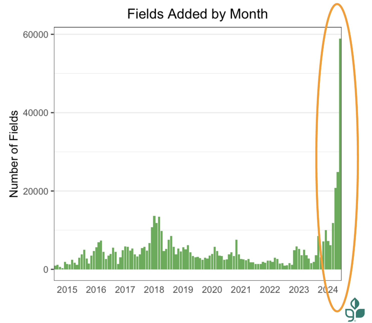
The project resulted in mapping 8.3 million acres for 5.2k farmers.
Overview
To design a digital mapping interface that allows the user to upload various sources (PDFs, legacy files, precision files), to create an intuitive drawing tool for users to draw their own boundaries or manipulate various government data grids, and prepare farmers for future regulations on traceability of their crops like the EU Deforestation Regulation (EUDR).
Title:
Senior/Lead Product Designer (Sole Designer)
Organization:
Gradable (part of Farmers Business Network - FBN) partnered with ADM (Archer Daniels Midland)
Project Roles:
Qualitative Research, Conceptualization, Design, Usability testing, Dev handoff
Tools:
Figma, GIS Tools, Satellite Imagery, Internal Mapping Applications
Data:
CLU (Common Land Units), PLSS (Public Land Survey System), Precision Data from Machinery Integration
Sources:
FSA (Farm Service Agency), John Deere Tractor Integration, Climate FieldView Monitor
Duration:
4 Months
Background & Problem
The core challenge was the lack of a single, trustworthy, and digitally verifiable visualization of field boundaries for our team to utilize for tracking farmer data. We had clunky tools that didn’t allow the farmer to understand their field boundaries and multiple sources of data.
Driving Force (New Regulations): The upcoming EU Deforestation Regulation (EUDR) required geolocated fields for certain crops to prove they were not grown on deforested land, leading to potential fees if non-compliant. This began as our driving force to update our mapping to be more intuitive and easier to use.
Incentivize: Mapping would initially be used for ADM’s re:source Program, to track soybean fields. Farmers would receive premiums per acre if they were compliant. This program would help farmers create traceable fields so that there would be no additional work for the EUDR.
Data Scarcity/Age and Source Data Variability: FBN/Gradable could not access USDA/FSA digital CLU (Common Land Unit) field boundaries newer than 2008 because digital records were only available for government agencies or non-profits. Farmer provided documentation was often in analog/static formats (scanned PDFs, photos of FSA maps) or abstract Lat/Lon coordinates to verbal road descriptions without visual context.
User Friction: When users received their CLU maps, many times they were provided with an abstract, coordinate-derived "blind shape," leading to low confidence in adding digital boundaries into our system and high risk of misidentifying land when our Data Operations Team would support drawing fields.
Operational Drag/Speed: Drawing or editing boundaries was cumbersome, forcing users to rely on FBN's Data Operations Team, creating a long, back-and-forth process and slowing turnover.
Data Loss Issue: Previously, modifying a shape saved it as a new field and needed a new name, causing the loss of historical data (crop, soil) attached to the former boundary and confusion on fields when names repeatedly changed.
Research, Interviews, and Testing
In order to tackle a challenge these issues, I knew this couldn't be built in a silo, even if it’s grain farming.
My design process was deeply collaborative, blending technical analysis of messy legacy data with direct feedback from the people who live and breathe this information.
Understanding the Pain Points:
I started with in-depth walk-throughs with the Data Operations Manager to map out the current manual bottlenecks.
I then spoke with our Sustainability Program Leads, the primary interface between FBN and the farmers, to fully grasp the real-world friction and compliance needs.
I interviewed engaged farmers themselves to ensure our solution prioritized their time and digital comfort.
The main pain points were:
No single location for uploading various data sets
Map drawing toolset was rudimentary, could not do needed shapes such as circles.
No editing capabilities of existing field shapes without help from FBN Data Operations and data loss.
Harmonizing Data Chaos:
The core technical challenge was allowing for users to be able to share their data from the varying sources in an easy and meaningful manner. This was a confusing UI for users, and many did not understand that they were able to upload data they had.
The main data sources we needed to direct users to and their limitations were:
Highly accurate Precision Data (like John Deere and FieldView files), however those may differ from government grids.
Analog/Static documents, from scanned PDFs to cellphone photos of documents from local FSA offices.
The underlying Standardized Government Grids (CLU/PLSS) that may be out of date.
Staged and Iterative Release:
This tool had a tight timeline for release to capture millions of fields for compliance so I designed the release to be in stages to ensure the development speed we needed.
I also actively gathered user feedback following releases, driving the development of three total, comprehensive updates and releases.
First being the collection of various data.
Second the first iteration of the map drawing toolset.
Third was adding more capabilities to the toolset
This commitment to iteration ensured the solution and timeline stayed fast, accurate, and useful.
Design Strategy
With all my research and team, my strategy focused on empowering the user through a streamlined ingestion and visualization workflow, and instantly providing them spatial context in our maps and simple tools for editing within that context
Data Synthesis and Prioritization:
Designed an ingestion workflow that allowed for multiple data inputs (Precision Files, PDF uploads, freehand drawing).
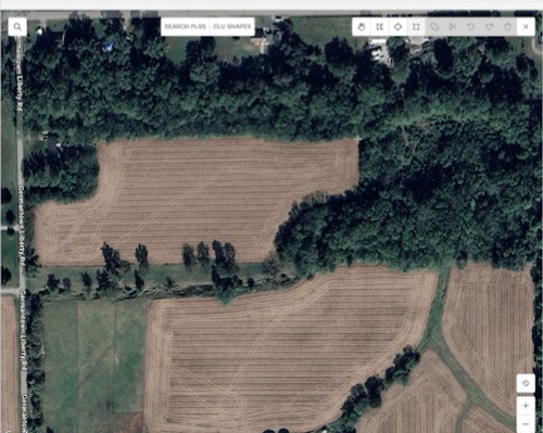
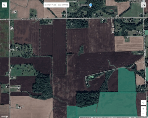
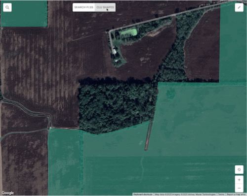
Selected high-resolution Google Earth/Maps satellite imagery as the non-negotiable basemap for visual "ground truthing."
Layering Logic for data: Precision Data (John Deere) was prioritized when provided over CLU/PLSS data.
Auto-Localization & Contextual Anchoring:
Auto-Centering: Used farmer address data to automatically center the map viewport on the field upon entering field map tools.
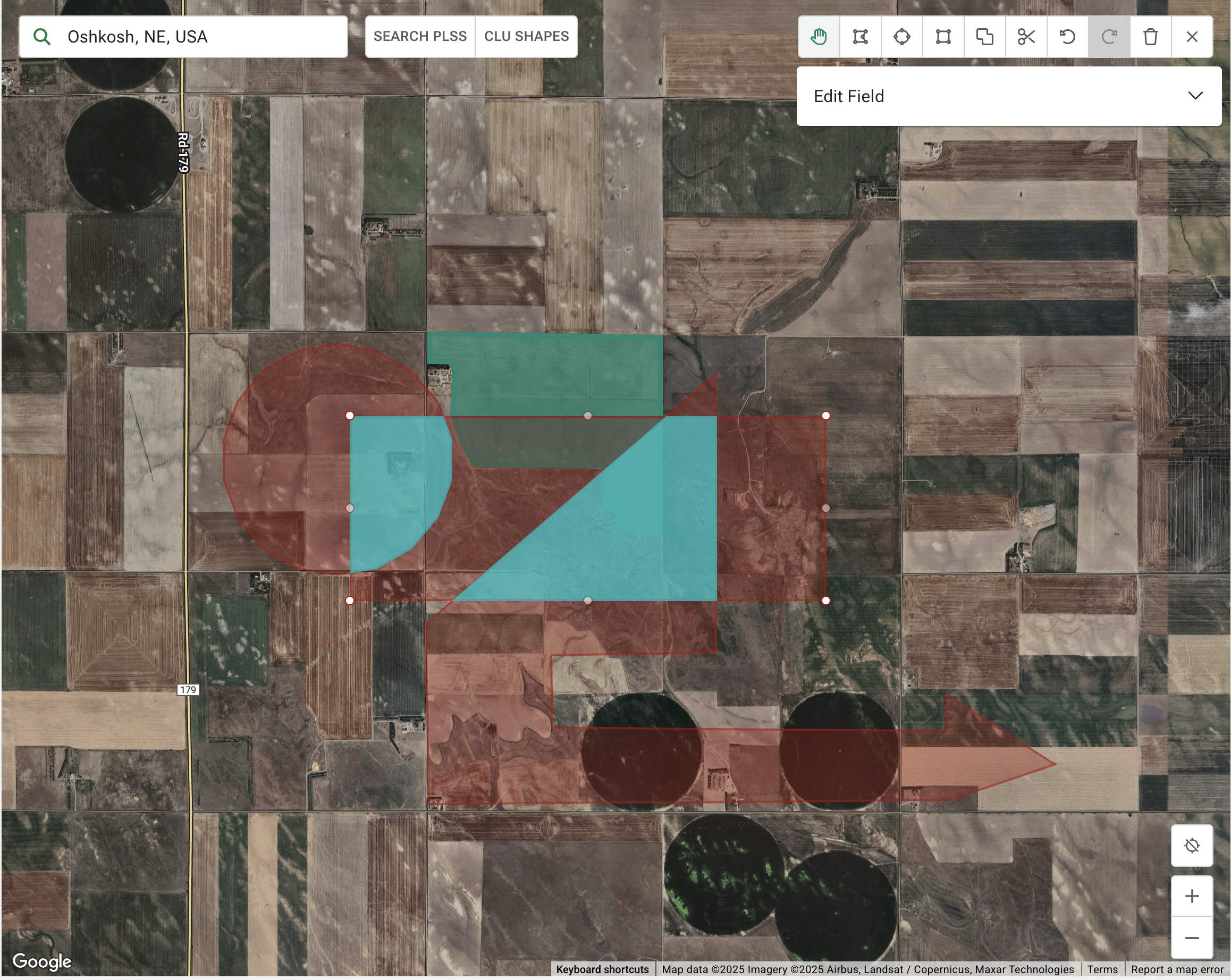
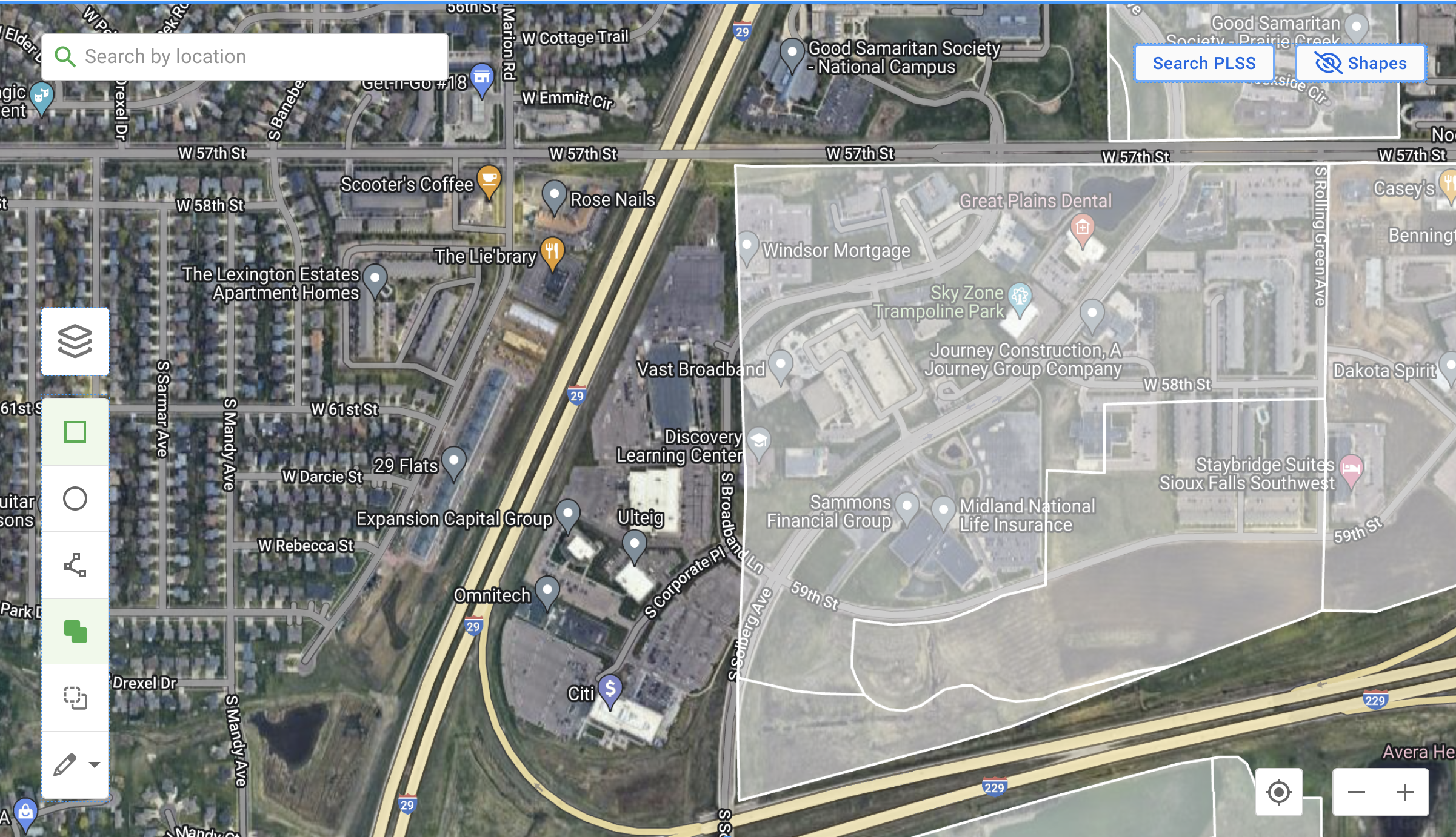
The "Ghost" Overlay: Rendered CLU boundaries as a distinct, semi-transparent "Draft State" polygon over the satellite image, allowing instant interaction and editing to the farmer field needs.
Toolset for Easy Editing:
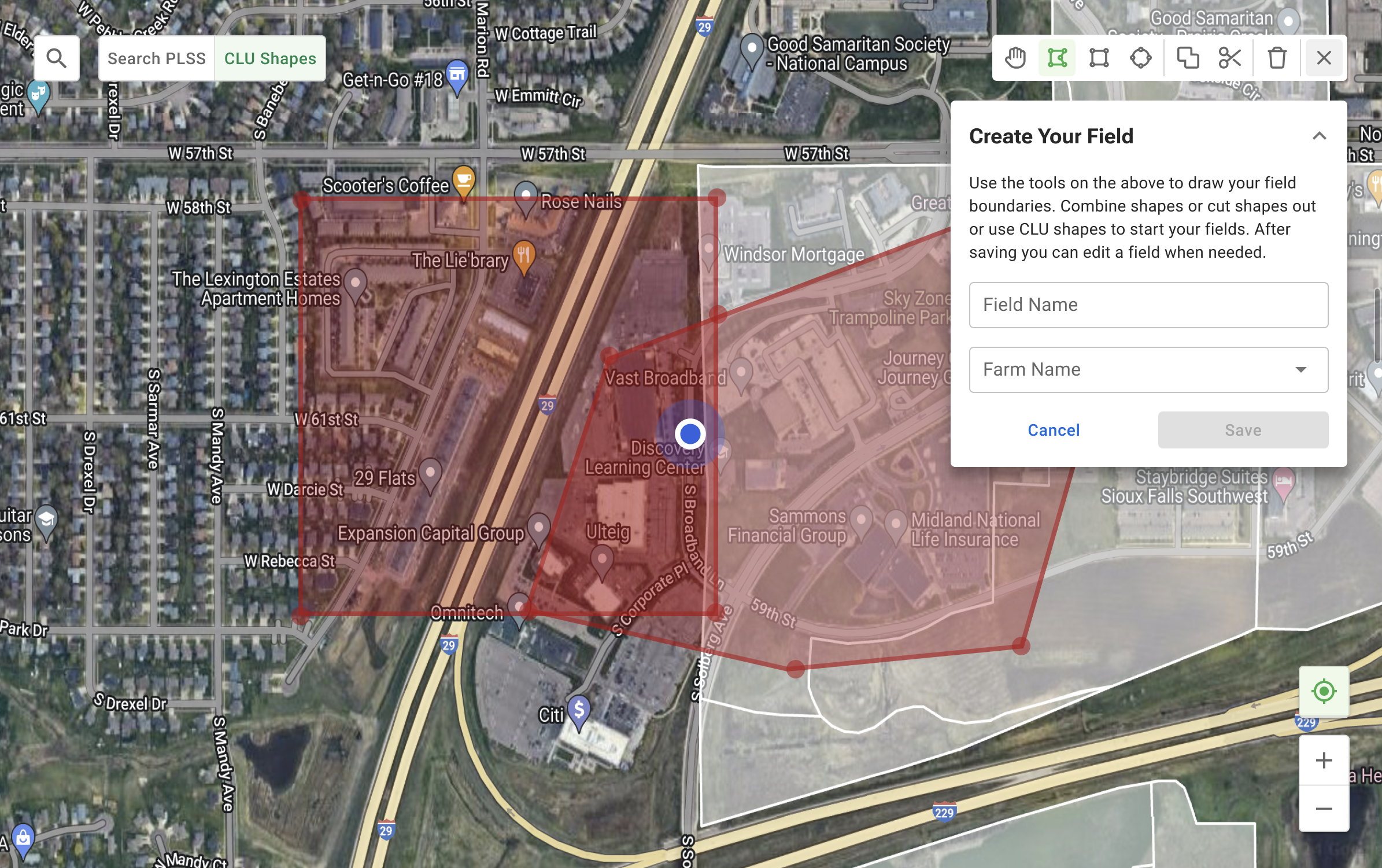
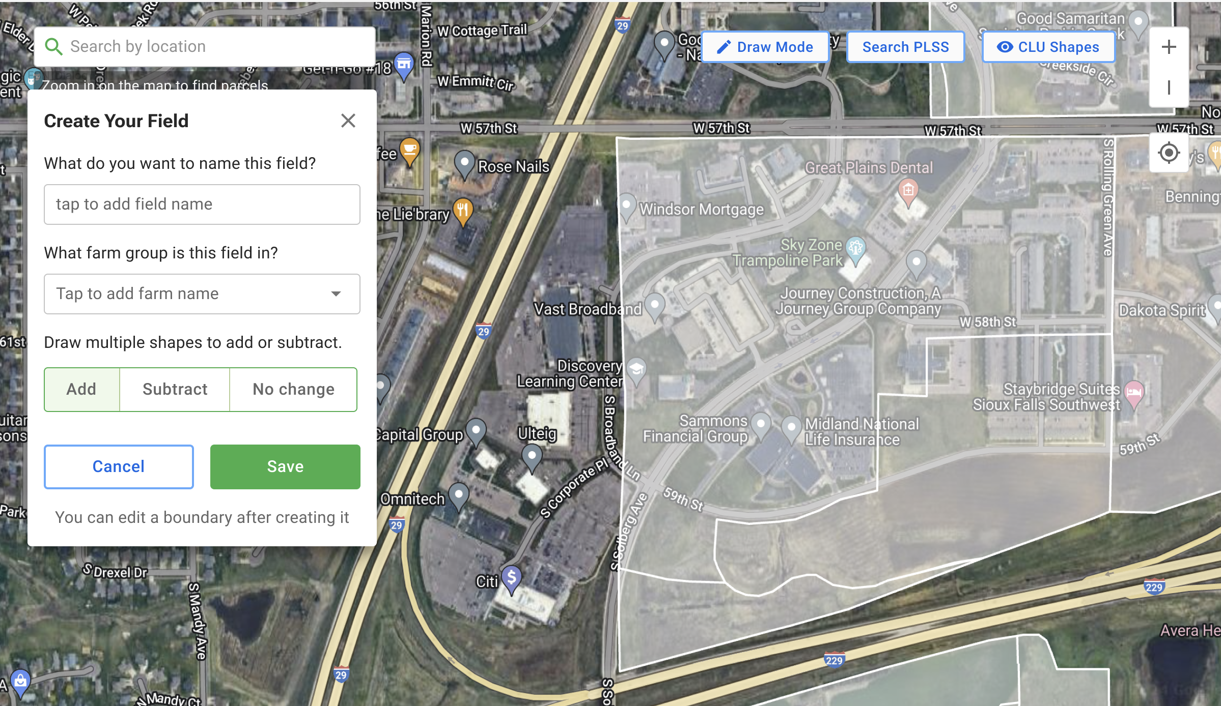
Using Material design, I created an expanding and contracting toolset for users to draw and manipulate the field boundaries easily.
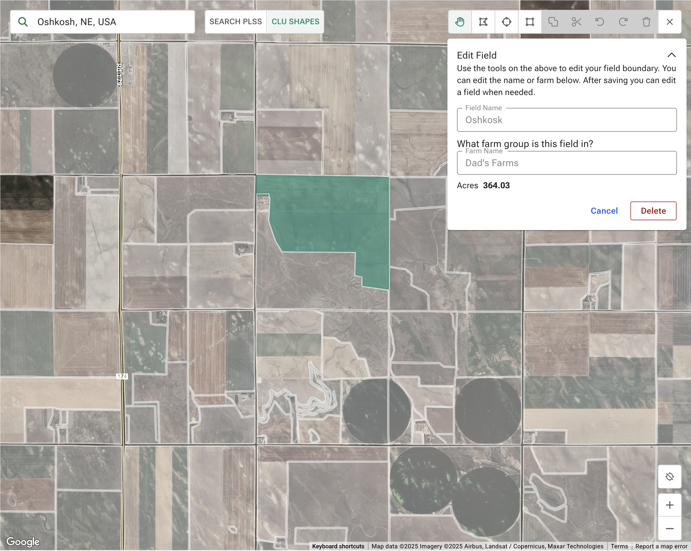
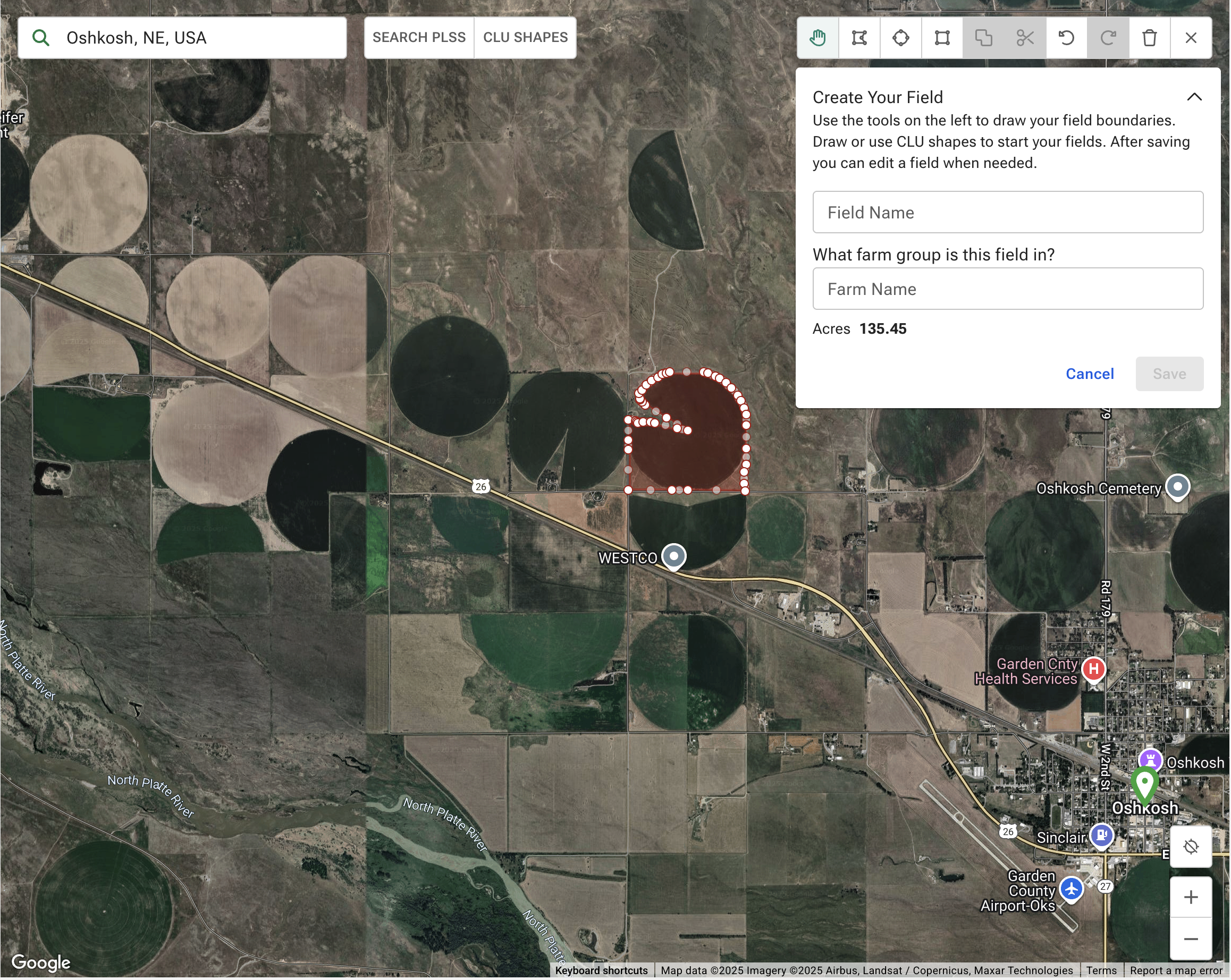
Tools were needed to allow users to create shapes, edit existing polygons, overlap/cut/merge shapes, rename field boundaries, reassign fields to different farms, delete fields. These needs were found in user testing, one big discovery was the need for circular shapes to draw fields.
Comprehensive error states, we needed to be able to inform the user when there was an error in their drawing or saving of the fields, I added multiple error states with descriptions to the UI. This ws found during testing that users were many times unsure of if the shapes were saved or updated.
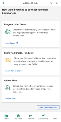
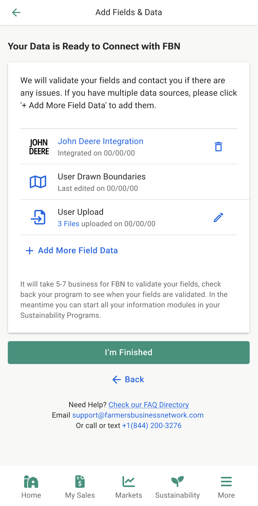
Ingestion User Flow
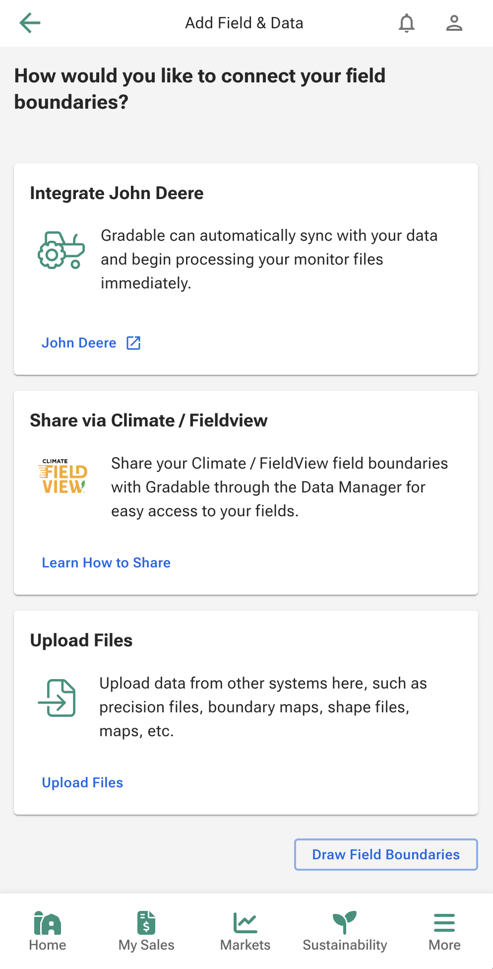
The existing process presented a major hurdle: the lack of a single, clear entry point for farmers to submit their data. We had multiple areas in the website where users could upload data and no context.
My first iteration on this project was creating a single area for users to be able to upload data and add context for the users to better educate on the data we can use for field boundaries.
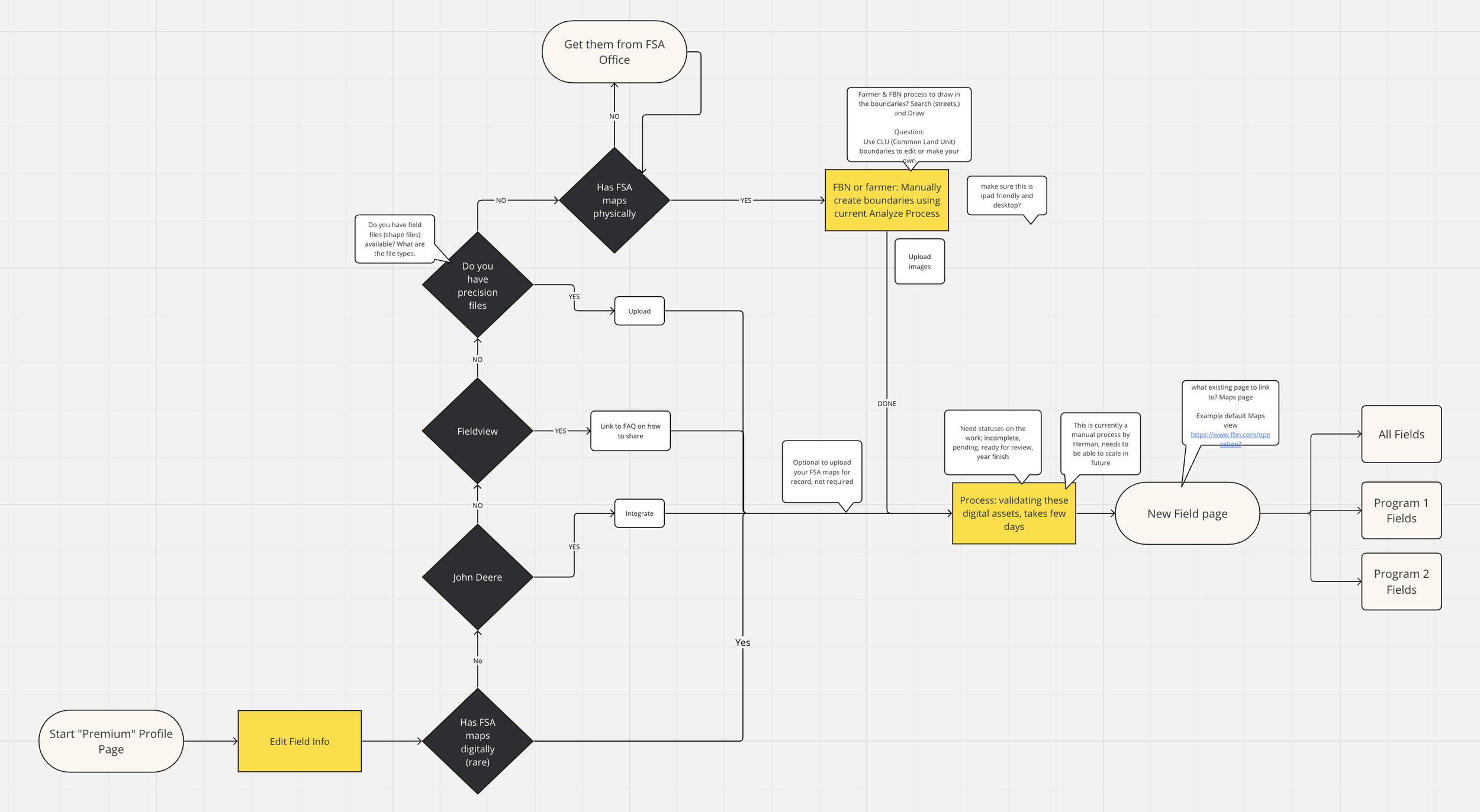
The design solution began by formalizing a Decision Tree Flow to guide the user based on the quality and format of their available data, ensuring the fastest path to digitization. This flow was critical to addressing the former operational drag and slow turnover of field verification which was a manual process that FBN employees worked through with inconsistent data.
The flow began with the user choosing how they would proceed in uploading data and consisted of user guided steps to support them. I tested this flow with users and our data operations team to land on a cohesive and easy to understand flow for uploading data.
Map Toolset Design
The largest part of this project was creating a more useable map editing interface. I had many iterations on the tool set but after interviewing users I landed on search in the top left with the map shape toggles to the right of search, a collapsable tool set in the upper right corner, and navigation tools in bottom right. This positioning was found to be easiest for a new user to read the screen and see the tools in order of their needs and familiar to many mapping tools they used in their daily lives, such as Google and Apple Maps
Iterations that did not test well.
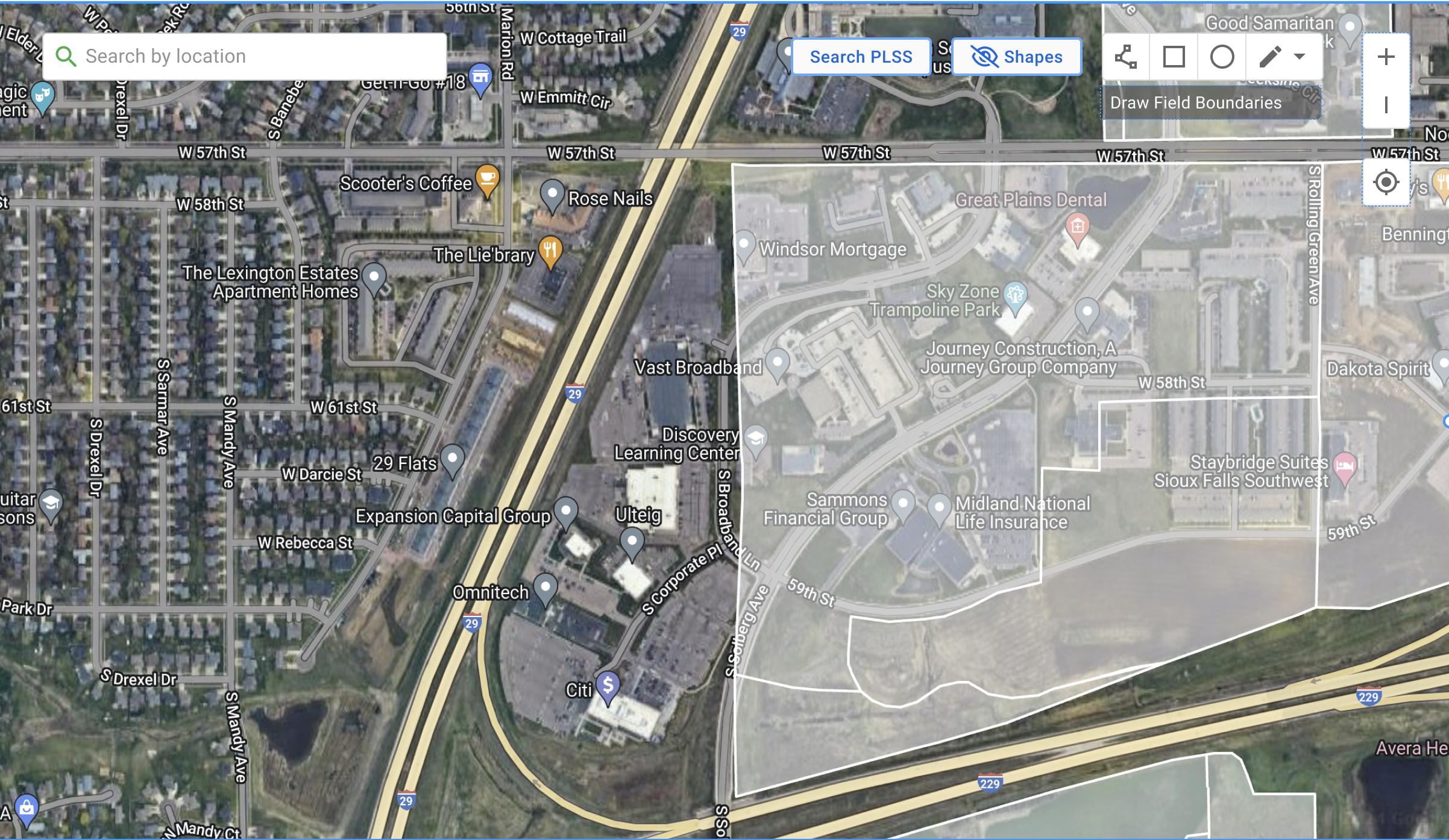
The toolset had to display and have capability to address a multitude of needs
Default Shapes (Circles/Rectangles): Solved cumbersome drawing/reliance on Data Ops, enabling fast, single-click creation of common field shapes. Adding circles helped solve the former issue of not being able to drawing circular fields which is very common.
Polygon Drawing: Our polygon tool was refined in order for faster clicking on the map to create editable points to the shape path.
Easy Removal/Subtraction (Cut Tool): Solved difficult editing for minute, precise adjustments, simplifying complex editing.
Fast Editing: Solved the issue of data loss if fields were edited and removed the need to reach out to Data Operations to link an old field name to a new field name, and allowed the user to manipulate the shape while retaining historical data of the area.
Compound Fields (Multiple Polygons as One Field): Created the solution of the problem when a field is actually multiple shapes, being that there is a stream or tree line or road through the field, creating multiple shapes for what is considered a single field.
Real-Time Acreage Display: Solved low confidence due to lack of immediate feedback, providing instant, quantitative feedback of how large the field is that was just drawn so that the user can confirm against their own knowledge of the field size.
Stylus Support: Solved the restrictive polygon format, enabling a fluid, natural drawing experience on mobile devices.
Tool bar expands when user interacts to begin editing fields. Additional editing tools are available when user begins creating complex shapes.

Testing with Prototypes
Utilizing Figma, I developed an interactive prototype that served as ttesting mechanism for the map's complex states. I then drove structured testing sessions with stakeholders, which proved invaluable.
By allowing them to engage directly with the flow, we proactively troubleshooted critical interaction pathways and validated the necessary features, an essential step that guaranteed the final solution was engineered correctly for large-scale compliance, use, and data ingestion.
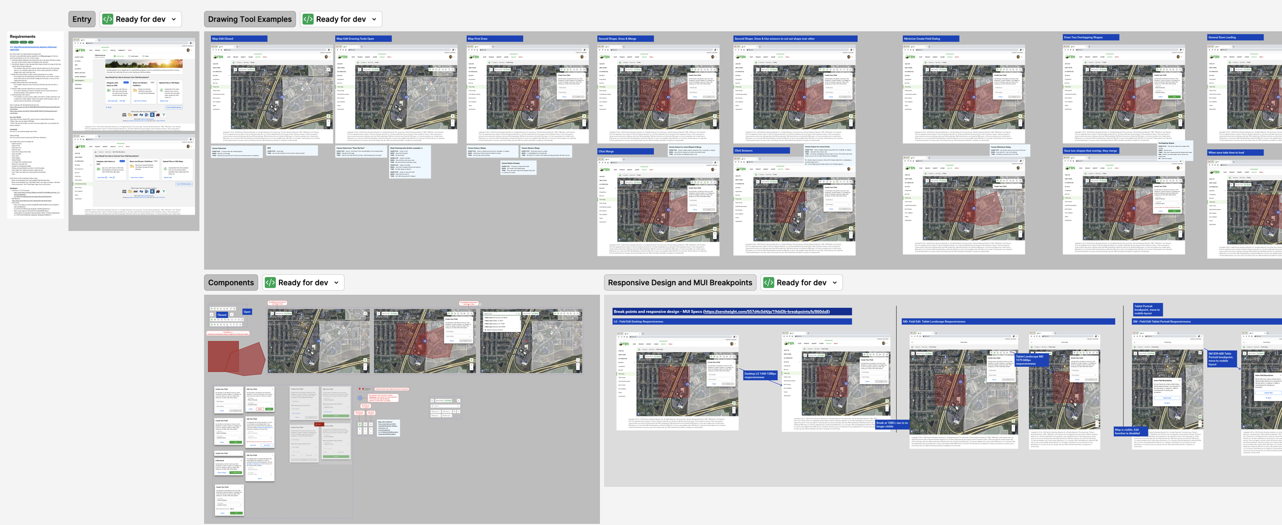
Interactions with Toolset
User can use polygon or shapes layered on each other to create cutouts in their field shapes.
User can use polygon or shapes layered on each other to merge them in their field shapes.
Users can use CLU boundaries and change the shape by moving the shape points.
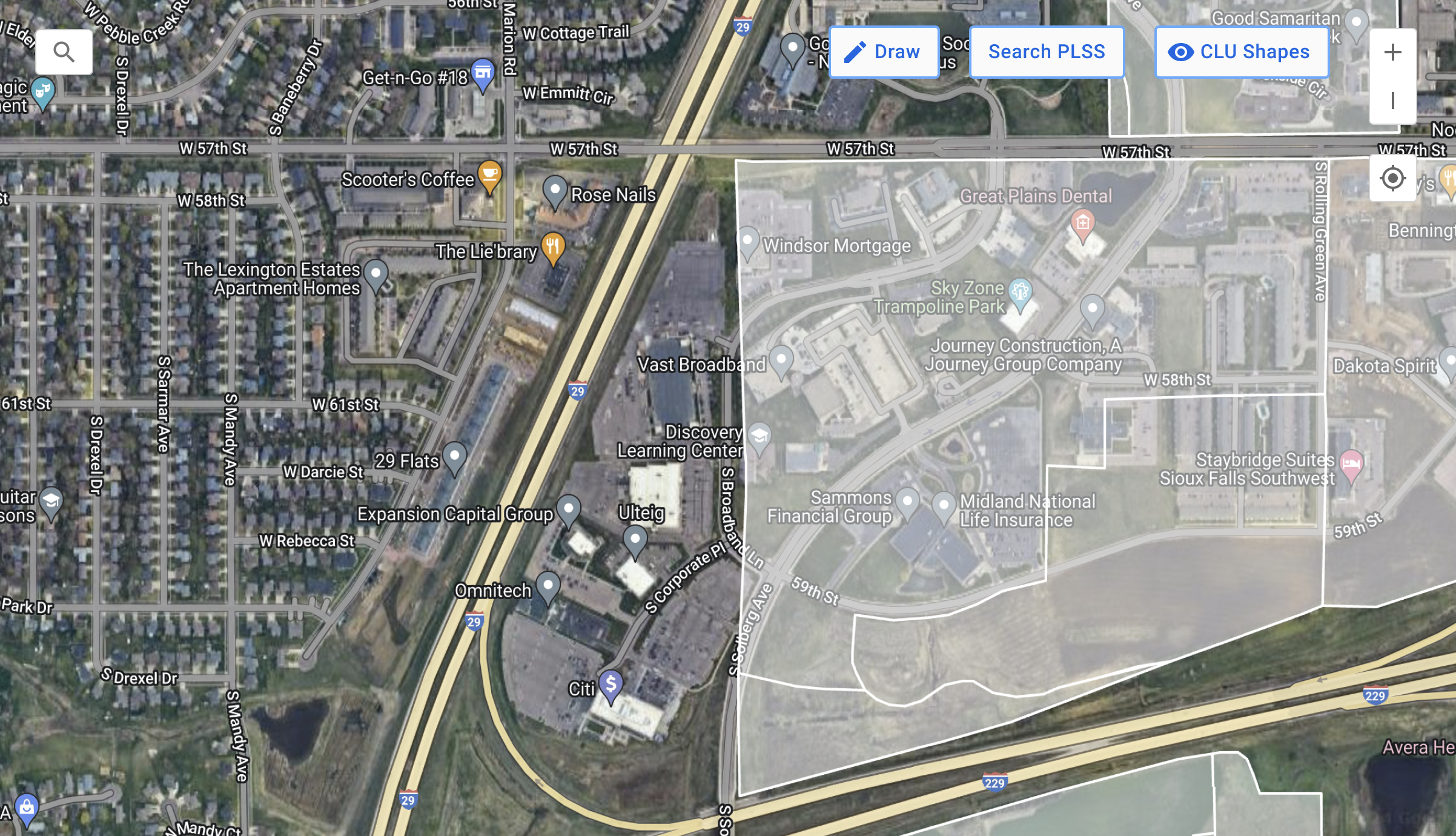
Using Existing Grid as Starting Point
Toggling on CLU Shapes shows a ghosted layer that is clickable and editable, which allows users to utilize FSA CLU boundaries for their fields and edit boundaries if needed easily.
Info Card
A collapsable information card allows easy edit and naming for drawn or selected fields along with showing the field acreage size.

Simplified Search
Utilized Google Places and Location API, users are able to pinpoint their field locations by address and/or road intersections.
Outcome & Impact
My design successfully created a high-confidence, single source of truth for field boundaries, positioning Gradable as a leader in compliance readiness.
Business and Financial Impact:
Market Access: The traceable mapping foundation positioned Gradable/FBN to seamlessly integrate EUDR requirements, ensuring farmers and grain merchants (like ADM) maintain access to key European markets.
Farmer Premiums: Resulted in over $19 million in additional premiums paid to farmers for soybeans grown with sustainable practices.
Scale and Efficiency:
Scale: Mapped and enrolled 5.2k farmers and 8.3 million acres in programs.
Speed: The new mapping tools enabled the processing of paper maps across 3.8 million acres and 3k+ farms in just two months.
Scalability: The system is now a robust foundation for future geospatial compliance and FBN AI model ingestion.