

Overview
With Weather Underground's overall rebrand, the city forecast page was where the most energy was spent. This product has the most page views than any part of our website and is a treasure trove of information. Our team had to re envision the page, creating a responsive web experience and new ways to visualize the data. After two years after the first redesign we needed to revisit the forecast page again as the business expanded more into the IOT arena and Air Quality.
Problem
The forecast page had been redesigned but was not designed for mobile web first. We also expanded our offerings to more dashboards, for example rain start stop, air quality, allergens, and history. These were not being prominently featured on the design and the design was not flexible enough to allow for these additions. We also wanted to bring more significance to our differentiating factor, our Personal Weather Station Network.
Research
The first step we took was looking at all the data we were currently showing and looking at the engagement, and also seeing what new data and visualizations we could create to make a better experience for the user. We looked closely at the page load speed on both mobile and larger web and learned what data was culprits to slowing the site down. We also worked on finding what elements were the most engaging and looked to how we could make these better.
Weather Underground Forecast page
Roles: UX/UI Designer
Project Type: Collaborative
Live: SF Forecast Page featuring Weather Underground's PWS
User Interviews
The main thing we heard when interviewing users was to not "dumb down the data". Our users wanted all the data we could give them and see it displayed how they wanted it to be. The three main data points that users wanted to see at a quick glance were: current conditions, radar, and forecast. I conducted User Interviews going over our current page, card sorting, and testing various prototypes from paper to digital.
I also created user stories with 5 personas on how different individuals would use the page based on existing and new user interviews. This helped us keep in mind the user journey and flow as we tested, designed, developed, and released.
User Testing
I conducted many tests with different users, first starting with hand drawn paper prototypes. I conducted these using actual paper with one on one tests, and also online through video and invision app. We found on mobile, users like seeing a small radar and current conditions as well as seeing the next day and half forecast at a quick view. They also preferred having the menu towards the bottom of the screen for easy access while holding the phone with one hand.

Wireframing
After I got an idea of the layout testing my sketched mockups, I moved on to wireframes to better understand what actually could be shown on a mobile screen. It was important to deesign the forecast page being mobile friendly first, because weather data on your mobile browser wherever you are was our greatest user need.


Design
One of our main objectives was making sure that the important information, the three main data points, was “above the fold” or quickly visible on large screens and easily accessible on smaller screens. This meant making sure current conditions, radar maps, and forecast were given similar importance.
We went through many different design iterations looking at the different possibilities of showing the many states you need on a weather site. How the warnings worked on the page, the hook to other dashboards such as rain and health pages.
We also created a modular system for all our additional information that may be pertinent to the user, our astronomical data, photos, news, state highs and lows, etc. This allowed for better grouping of data. Below the main three elements we implemented a lazy load to help with page speed, the bottom only loading once the user scrolls down. With this redesign of the layout we drastically cut the length of the page, made it faster and more accessible on mobile devices. This modular system was also very important when looking at adding more additional dashboards to the forecast page as we expanded. It was very important to make the page flexible to allow growth and consider ad placement so that we retain revenue but do not bother the user too much.
We created a somewhat different experience on mobile devices, moving the forecast page dash menu down to the bottom where most people engage with their thumb on mobile. This allows the user to quickly tap through the different forecast page components quickly and not having to scroll to the top again.
An additional feature we brought out front and center was also encouraging users to sign up for our forecast emails. We found tremendous engagement from this feature and found it complimented our forecast page. I also redesigned the forecast email to reflect the new designs on the web.


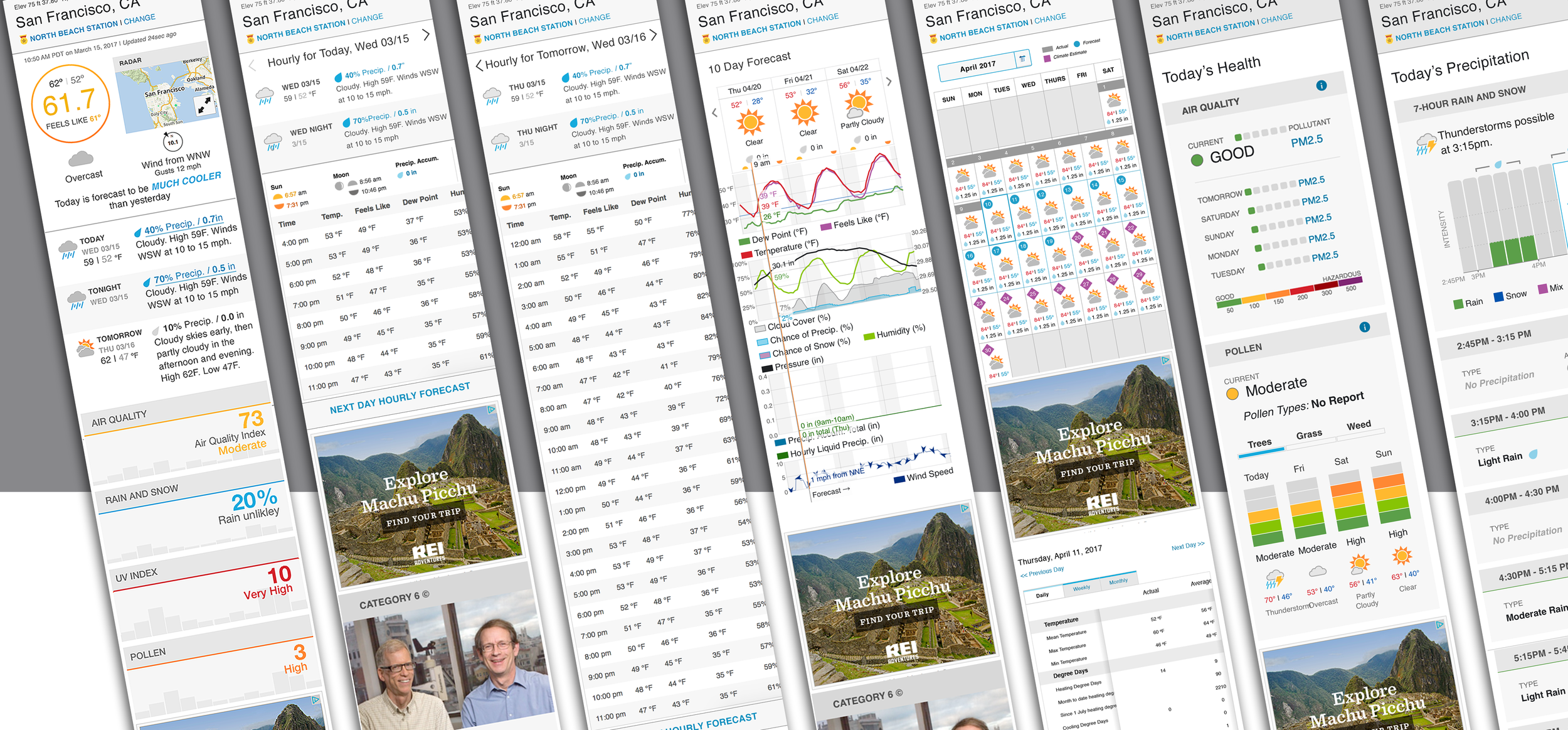
Personal Weather Stations
Another important element to our company and the forecast page was the ability to switch between our Personal Weather Stations (PWS), this is a feature unique to WU and creates the company having the largest network of stations, more than governments combined. We created an experience where the page opened up to reveal more information, including a map of the stations and list, this allowed the user to search for the name of a particular station or use the map to orient themselves to the nearest station to what they need. This allowed for more control on the user’s part to decide what information they need, and to get more localized information instead of most weather websites directing the user to the closest airport weather station, or choosing for the user.
A/B Testing
With optimizely we were able to launch a beta for users to test and also launch an A/B versioning of the beta. This helped inform us what was working and users enjoyed and what we could move on from.
Outcome
In the end we worked to make sure all the data was still there but better organized. One concern that users had was to not “dumb down the data”, and we worked hard to organize it and not change it. We kept the same data and added more to it, while optimizing visualization, creating a responsive site, and cutting page speed. We had a significance increase of people spending time on the forecast page as well as engaging with the new division of the page.
In terms of advertising, we optimized our ad footprint to have less ads, but better placement which increased our monetization.
