
Precision in the Storm: Redesigning Weather Underground’s Radar Experience
At Weather Underground, I designed and delivered a unified, high-performance radar mapping system that serves as a core differentiator for our global weather platforms by including varied radar experiences from static to interactive mapping. This system integrated a scientifically-driven color palette with optimized, responsive map rendering to ensure users could accurately interpret storm severity and make critical safety decisions.
The project resulted in a dramatic reduction in page load times, a significant surge in mobile engagement without removing or ignoring older systems, and established a visual standard that remains in use across both Weather Underground.
Background
Radar is one of Weather Underground's differentiating factors in weather websites and apps. It is one of the only weather services that provides raw single site radar data to composite national radar. It has always been a pillar of WU’s offerings however was not maintained over the years.
Live:
Weather Underground Radar
Title:
Product Designer, Map Designer (Sole Designer)
Organization:
Weather Underground (part of weather.com)
Project Roles:
Interviewer Researcher, Conceptualization, Design, Usability testing, Dev handoff
Tools:
Sketch, GIS Tools, Network data streams
Data Sources:
NEXRAD
Duration:
4 Months
The Problem
Collaborating with a researcher, I spearheaded a comprehensive audit of WU’s mapping products to identify critical optimization opportunities and define a strategy for sunsetting legacy tools. My audit revealed that our radar ecosystem, which was our brand’s primary product differentiator, had become a fractured collection of disjointed features built over different eras.
I identified significant technical and design debt across the suite: inconsistent color palettes, non-responsive layouts, and fragmented navigation. As our second most-used feature, these inconsistencies directly undermined user trust and safety. Users reported that a lack of visual definition turned intense weather systems into "storm blobs," making it nearly impossible to accurately assess the severity of approaching threats.
My objective was to transform this disjointed suite into a unified, high-performance, mobile-first experience that translated complex meteorological data into precise, actionable insights for our users.
The Goal: Establish a standardized visual language and mobile-optimized infrastructure to ensure clarity, consistency, and reliability during critical weather events.


Variation in WU radar products.

Different basemaps that WU radar would appear on.
Part 1 - New Radar Palette
Research
I conducted an exhaustive audit of Weather Underground’s mapping inventory, cataloging every radar instance into a master spreadsheet to analyze user engagement and navigation architecture. This data allowed me to map the entire user journey and identify critical redundancies. By cross-referencing engagement metrics with product health, I prioritized the radar experience as our most vital touchpoint for user retention and safety.
“Their lightest shade of green may not reach the ground. Then shades of green covers light rain to light moderate rain. Once it hits yellow you know you’re going to get wet. And up from that with oranges and up you don’t want to be outside, have a window, skylight or door open, etc”
- Frank
User Interviews
To better understand how users interacted and understood radar, I led a series of user interviews to decode how our audience interpreted complex reflectivity data. Although the colors don’t pose a scientific significance other than defining density, I found that people have very strong emotions and thoughts tied to the colors. My research also uncovered a significant psychological disconnect: the existing "smooth" gradient palette caused "visual inflation," where storms appeared more severe ("too hot") than reality.
Key findings included:
Loss of Detail: The lack of distinct color steps transformed complex weather systems into indistinct "storm blobs," obscuring the internal structure of the cells.
Psychological Color Mapping: I discovered that users have ingrained mental models for color (e.g., Yellow = wet, Orange = danger). Our legacy palette ignored these associations, leading to confusion and mistrust in the data.
Radar Palette Change
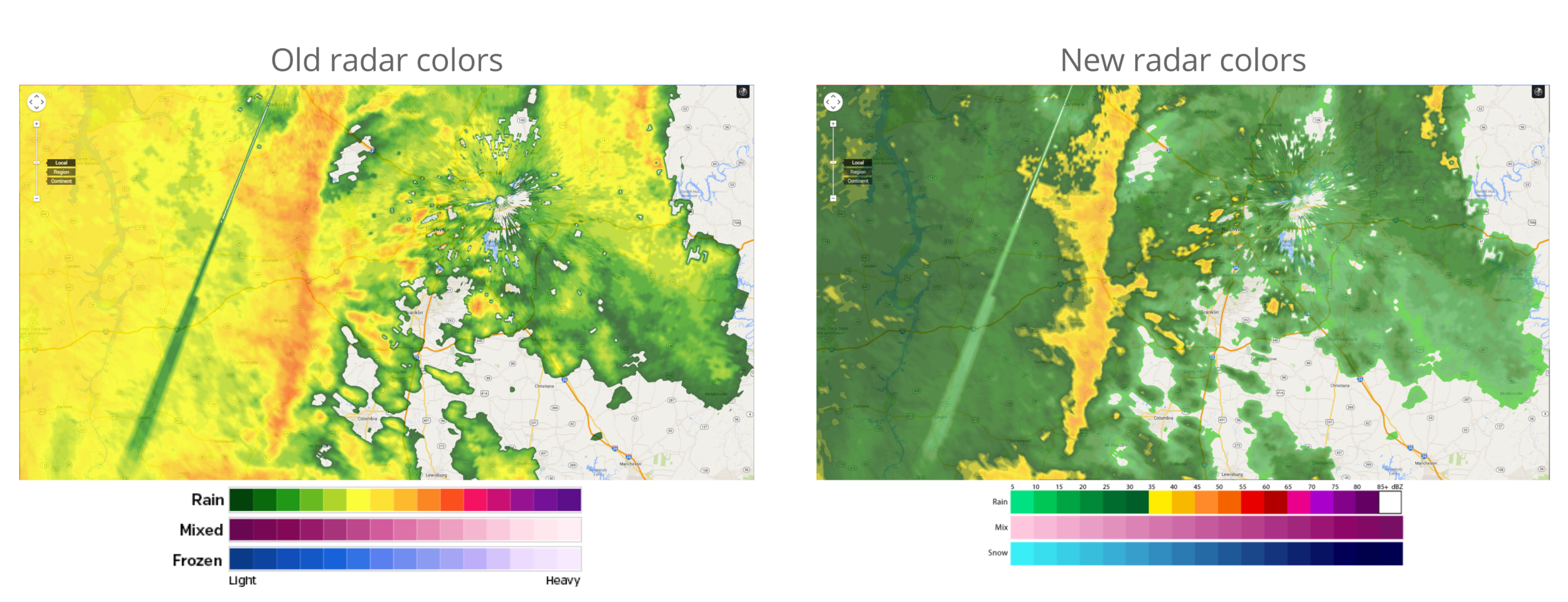
By researching what radar DBz meant and the functions of radar, along with competitive analysis, we restructured the radar palette. We created a palette that had very distinct color changes for what could be light rain, constant rain, and severe storm.
The new palette makes it much easier to identify storm structure and storm intensity. The yellows and reds that represent the most intense part of a storm are now easily distinguished from the lighter, less intense aspects of a storm. Especially made easy to track dangerous weather features like severe thunderstorms and tornadoes. This allowed our users to be able to make better decisions about the storm. It also benefited our Meteorologists in identifying quickly the densest and strongest area of a storm.


New Palette

Comparison of old radar palette to proposed palette after research and testing.
Testing
Once the palette structure was determined, we tested it again to make sure it was better understood. We also tested it on a multitude of basemaps. This palette needed to be able to be quickly read on our custom maps, google, bing, and apple maps. In testing our users felt that the palette more accurately described the weather conditions and that the storm didn't look as thought it was made to appear worse than it is. Users were able to pin point dense areas of the storms quicker and where the rain changed to mix, and snow easier. Once tested and refined I wrote the palette code for our mapping products and we shipped the radar palette to all our products creating a consistent radar product across the WU brand. The "Moyer Palette" is still being used across our products and has been used to inform changes in the weather.com radar palettes as well.
Phase 2 - Better Map Experience
Overview
The second phase after determining the palette changes was of reinvigorating our mapping products was taking our static map products and making them more user friendly, and less of a load on the site. Although interactive maps are the future, many users complained about loading time especially on mobile web. So we found that redesigning our static, or what I call interactive-lite maps would benefit the users needs. These maps load fast since they are gifs, but still allow the user to move to different regions, zoom in and out, and animate the radar.
User Task Flow
After interviewing users, we created a user stories in order to think on how the user may interact with the product in many different ways, whether it was during a storm, planning for the next few hours, or checking in on someone on a different coast. With these stories we created a user flow to help inform the final design of the pages. In this we also rewrote the landing urls, in order to create an easier user flow, and created new standard sectors for regions on our maps.
Wireframes
We created wireframes with our new maps in order to see what worked with our new flow and what needed to be reworked. We found the users or radar products were much more comfortable with simplified navigation that interactive maps sometimes lack.
Testing
We then tested with a gif created or the full United States, this sets us apart since many sites only show CONUS. The user is able to play the loop of the past 12hrs, or click on the map to view a more regional view. From this the user can also click to see even closer and view the single site radar data that has not been altered and stitched together with other radar site imagery.
Outcome
We found on on this project that the load time on the radar pages dropped dramatically, and mobile web use went up. We created a seamless responsive radar product that allowed the user to access the product on more than one platform. More people visited the new radar pages and spent more time on them. We also through the audit were able to sunset old radar products, cutting out products that needed to be maintained.
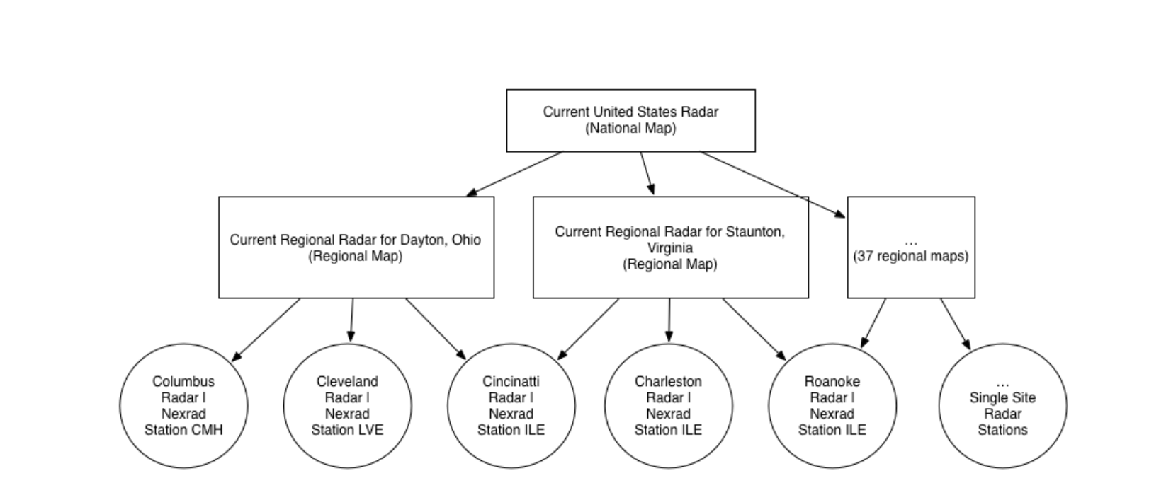
User Flow for new US Radar


